Guest post by Tellwell designer Tara Price
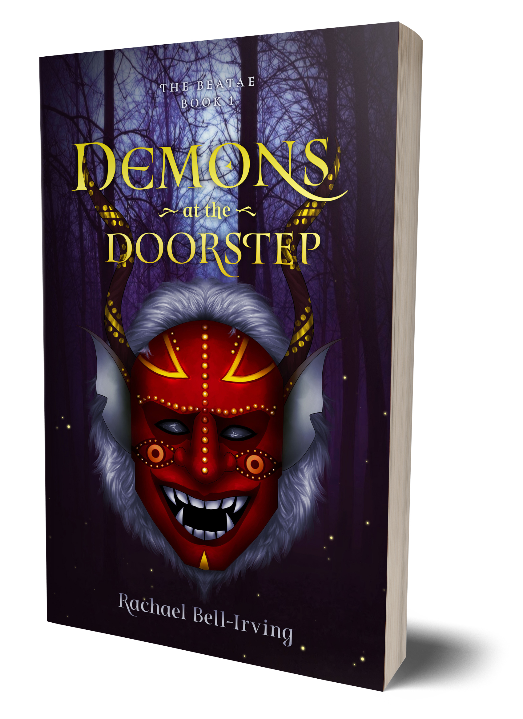
Demons at the Doorstep is a young adult urban fantasy. Written by Rachael Bell-Irving, the story follows Jessica, a witch who must team up with her mortal enemy to stop mutated demons from destroying her city. Hard copies and eBooks are now available on Amazon, Barnes and Noble and Chapters Indigo.
Why did you choose this cover as a monthly focus?
This was a book that I started working on at the end of last year that wrapped up mid-April. It was a little out of our normal process because it required a custom illustration. A lot of the time, the cover is either done first or designed in tandem with the interior. For this one the interior was formatted well before the illustration was done. I had an initial idea of what I wanted for the title, but I knew that it may change drastically when the cover was on my plate. However, once I saw this amazing image, I was able to work in the title surprisingly well, with only minor re-working on spacing.
What inspired you to create this cover? What was the inspiration behind your font choice?
This cover was built around the illustration done for the author. So it came with its own starting off point. My main input on the cover was type choice. For that I went with a font called Turquoise. The reason I chose this font was the almost evil undertones and extensive glyph library. The swoop on the N, the roundness of the E and the symbol in the O were particularly nice.
What was the most challenging aspect of creating this piece?
Actually, this cover was a breeze to create. Because it came with a great illustration that completely conveyed its meaning, I didn’t have to spend time looking for images that may or may not work as well. I think the biggest challenge would have been figuring out title font and layout without knowing what space I had to work with. I really love books that take the custom illustration route, because it adds a much-needed uniqueness.
Did you use any interesting techniques in creating this cover?
The title treatment started out as a black and white vector in Adobe Illustrator. Once done, I placed it on top of the image within Photoshop, adding a gradient in a yellow colour, sampled from the image, added a bit of a drop shadow, and used a layer mask to hide parts of the title around the horns.
What was your favourite aspect of the cover?
The vibrantly intense colour palette. I love how the red, yellow and purples play off each other. I really can’t wait to see what’s in store for book 2.

